
BLOG
NOBODY IS SMARTER THAN THE XS AND OS
- By Terry J. Atzen
- •
- 17 Feb, 2016
At The Investment Compass we are all about The Law of Supply and Demand. There is no other concept an investor needs to know in order to become a successful investor.
The reason for our commitment to this Law is because supply and demand are the only economic forces that affect the price of anything.
The price of homes, automobiles, groceries – anything – and that includes stocks, bonds, commodities, mutual funds and any other investment vehicle is determined by the prevalence of either buyers or sellers. Nothing else matters.
Many would argue that the matter of pricing is way more complicated. They would prefer to believe that fundamental factors such as corporate earnings, company sales, PE ratios or even which political party is in power are the factors that determine prices. All of those factors are categorized as “noise” here at The Investment Compass.
Buyers and sellers determine prices – it is as simple as that. Furthermore, we don’t even have to know why they are buying or selling. we are only interested in the prevalence of one or the other – if buyers prevail, prices move higher, and prices move lower if sellers prevail.
So the good news for investors is that there is available to them a pictorial representation of supply and demand which allows us to see where there is supply and where there is demand for nearly any investment vehicle. This pictorial representation shows us whether buyers are prevalent or if sellers are prevalent.
This representation is technology that has been used for well over a century and it is called a Point-and-Figure chart.
Point-and-Figure charts are unique in that what is mostly seen are Xs and Os.
The Xs represent buyers and the Os represent sellers. When one sees a column of Xs, we know that there are more buyers than sellers. On the other hand, when we see a column of Os, we know sellers are dominating that investment.
Below is an example of a Point-and-Figure chart of a stock many investors are familiar with – Intel:
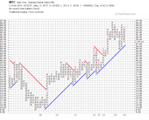
Since 2009 (see the years along the bottom of the chart), Intel has mostly been in an uptrend – roughly tripling in price. Notice the columns of Xs and how the buyers – because of demand – consistently took the price to higher levels. Buyers of Intel made the price go higher.
One can also see the impact of sellers by observing the columns of Os. Sellers – because of supply – forced the price lower. Sellers made the price go lower.
We don’t necessarily know who the buyers and the sellers are and it really doesn’t matter who they are. All we know (and need to know) is their existence.
Nobody is smarter than the Xs and Os.
Weighing-In on Gold and Silver……..What’s the Real Truth
In the past few weeks, I have been amazed by the extreme range of predictions on the price of Gold and Silver (Harry Dent [ www.economyandmarkets.com ] says $750 and Jim Rickards [ www.silverdoctors.com/Jim-Rickards ] says $10,000), so I decided to weigh-in on the subject (without the predictions!).
Let me say first, that this is a great example of why I wrote my book and why I do the work that I do.
Pundits can, and do oftentimes confuse investors. This creates doubt and causes investors to ask, “Who do I believe? Who is correct? “What is the Truth?”, and as the result, end up doing nothing when their personal instincts say otherwise.
My work is about “What Is” – logical, simple and easy to understand.
As usual, my analysis begins with an index, in this case, the Index for each of the metals, then the respective ETFs as well as the Inverse ETFs for verification.
And, at the end of this blog, I will take a look at the Gold/Silver ratio that many folks like to monitor.
First, the Gold Index:
Update on Gold
Gold has been a “hot” topic in the media so I decided to check-in on the subject – showing you what is really happening.
First of all, the Gold Index: (If you click on each chart it will make them larger)