
BLOG
WEIGHING IN ON GOLD AND SILVER – WHAT IS THE REAL TRUTH
- By Terry J. Atzen
- •
- 20 Aug, 2016
Weighing-In on Gold and Silver……..What’s the Real Truth
In the past few weeks, I have been amazed by the extreme range of predictions on the price of Gold and Silver (Harry Dent [www.economyandmarkets.com] says $750 and Jim Rickards [www.silverdoctors.com/Jim-Rickards] says $10,000), so I decided to weigh-in on the subject (without the predictions!).
Let me say first, that this is a great example of why I wrote my book and why I do the work that I do.
Pundits can, and do oftentimes confuse investors. This creates doubt and causes investors to ask, “Who do I believe? Who is correct? “What is the Truth?”, and as the result, end up doing nothing when their personal instincts say otherwise.
My work is about “What Is” – logical, simple and easy to understand.
As usual, my analysis begins with an index, in this case, the Index for each of the metals, then the respective ETFs as well as the Inverse ETFs for verification.
And, at the end of this blog, I will take a look at the Gold/Silver ratio that many folks like to monitor.
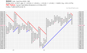
First, the Gold Index:
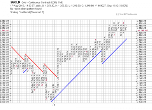
Clearly, the Gold Index has been in an uptrend since the beginning of the year.
Strong support exists at 1210 and triple-top resistance stands at 1370.
Next, a look at the Gold ETF, GLD;

Again, the uptrend from the beginning of 2016 is apparent as is the downtrend since 2013.
What is noteworthy is the event of buyers taking GLD above the resistance (and the red resistance line) at 122 in June, creating the column of Xs up to 130.
Resistance now stands at 132, then 136 and 142 – these are the levels to monitor.
And, as confirmation that an uptrend is in place, I like to look at the Inverse ETF for any additional clues.
Lastly, a look at the Inverse ETF for Gold, GLL:
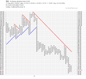
There it is – GLL, as one would expect – in a downtrend since the beginning of 2016.
It did rally to the red resistance line in May and since June, sellers have continued to sell down to the new low at 65 (now the latest support level).
This series of three charts confirms the uptrend of Gold and the only prediction I can make is that (referring back to the first chart above), if buyers take the price over the resistance at 1370, Gold will likely go higher.
I am always asked – how high?
A look at a longer-term chart will give us some clues.
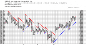
Beyond the current resistance at 1370, resistance can be seen at 1390 and above that at 1430 – that’s how high it might go initially.
Those aren’t predictions, they are simply levels at which buyers have been willing to pay in the past (pretty solid information).
Next, we’ll do the same analysis of Silver. First, the Index:

The Silver Index presents a similar picture to that of Gold (not always the case), with the uptrend perhaps beginning of 2016 with buyers having taken the price above the red resistance line.
Resistance above 21 can be seen at 22, 24 and 25 with support at 16 as well as the blue support line which is roughly at the same place.
I would submit here that, unlike Gold, this Index needs a bit more of maturation to definitively say that it’s in uptrend.
So let’s see what the ETFs show us….first SLV:
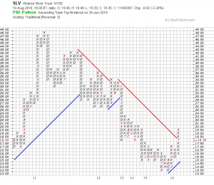
Wow….looks just like the Index.
And, my conclusion is the same – a bit premature to call an uptrend, but a damn good start – a column of Xs penetrating the red resistance line with further resistance at 20, 21 and 23. Support is at 15 and the blue support line at 15.50.
Again – pretty good signs the beginning of an uptrend.
On the next page is the Inverse ETF of Silver – ZSL:
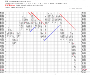
Sellers Rule – and Buyers want nothing to do with this one!
To me, this pretty much confirms the uptrend that looks to be in the beginning stages for Silver.
For those of you that are not familiar with The Investment Compass, Silver is not a component of The Investment Compass, however, many subscribers will substitute Silver for Gold in their portfolio and in some cases own both.
So, that leads me to a discussion of the Gold-and-Silver Ratio.
First of all, the Gold-and-Silver Ratio is a simple mathematical calculation that is nothing more than the price of Gold per ounce divided by the price of Silver per ounce.
Historical data for this calculation goes back to 1915 – so it’s been around a while and lots of folks focus on it on a regular basis. There are a lot of interpretations for the use of this ratio. The primary one is whether the prices of each are low or high, relative to each other.
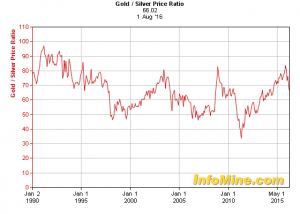
When the ratio is high, the general consensus is that Silver is favored, and of course, the reverse would be true, when the ratio is low, Gold would be favored.
If we do the calculation based on current prices, it would be approximately 1349 divided by 19.6 – or 68.8 which, as one sees, would be at the higher end of the chart, thus favoring Silver.
If, for example, Gold would go to the highest resistance level as I discussed earlier – $1440 per ounce – and Silver rises to its highest resistance level of $25 per ounce, the ratio would be just under 58 – well within the range of the last 10 to 15 years (falling into the category of “Cool stuff to know”).
Now, if you want to do the math on Harry Dents’ and Jim Rickards’ predictions from the first page – be my guest – but be forewarned, it might only add confusion.
Be that as it may and now that I have shown you The Truth, you might want to know that this Investment Coach finds both precious metals very inviting as an investment.
Terry J Atzen, President & CEO
The Investment Compass, LLC
Cell: 406.407.0608
Update on Gold
Gold has been a “hot” topic in the media so I decided to check-in on the subject – showing you what is really happening.
First of all, the Gold Index: (If you click on each chart it will make them larger)
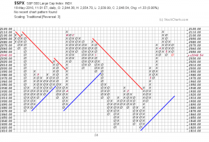
Once again, stocks are at a critical level and investors need to be aware of where the stock market is and pay attention to their stock portfolios.
As you can see from the chart below of the S&P 500 Index, stocks made an amazing recovery from the 1820 level (twice this year) and ultimately reached the previous high made last year (at 2110).
Currently, the chart below of shows that prices are once again at a critical level as buyers and sellers continue their daily trading.